


Section 01 Brand
Aurore seeks to answer the question: How might we use design as a way to help those with trauma?
With that said, Aurore aims to aid those experiencing trauma with consistent short-term and long-term support by providing users with the choices of healing rituals, emotional support, mood tracking, and monthly care packages. Everybody has baggage, but not everybody has the support or a way to process it. Aurore is here to ground you in your dawn of healing to become a stronger, healthier version of yourself.

The logo of Aurore stems from the Nordic rune, Dagaz, a primitive butterfly-like symbol of light and life that conveys the shift from night to day, the ascendance from darkness, and the promise of a better tomorrow.
Section 02 Ideations
As I began to ideate potential wireframes for both desktop and mobile screens, I learned that there are two central platforms that create the Aurore brand: a mobile platform for personal health and an e-commerce site for purchasing monthly care packages. Within the platform of the mobile app, I've developed four key features that address consistent long-term and short-term support: mood tracking, emotional support, healing rituals, and care packages. As for the website, its two functions are to teach users about the Aurore app and allow them to subscribe to care packages (this feature is also available on the mobile app, however some users may feel less secure using their phone for purchases).
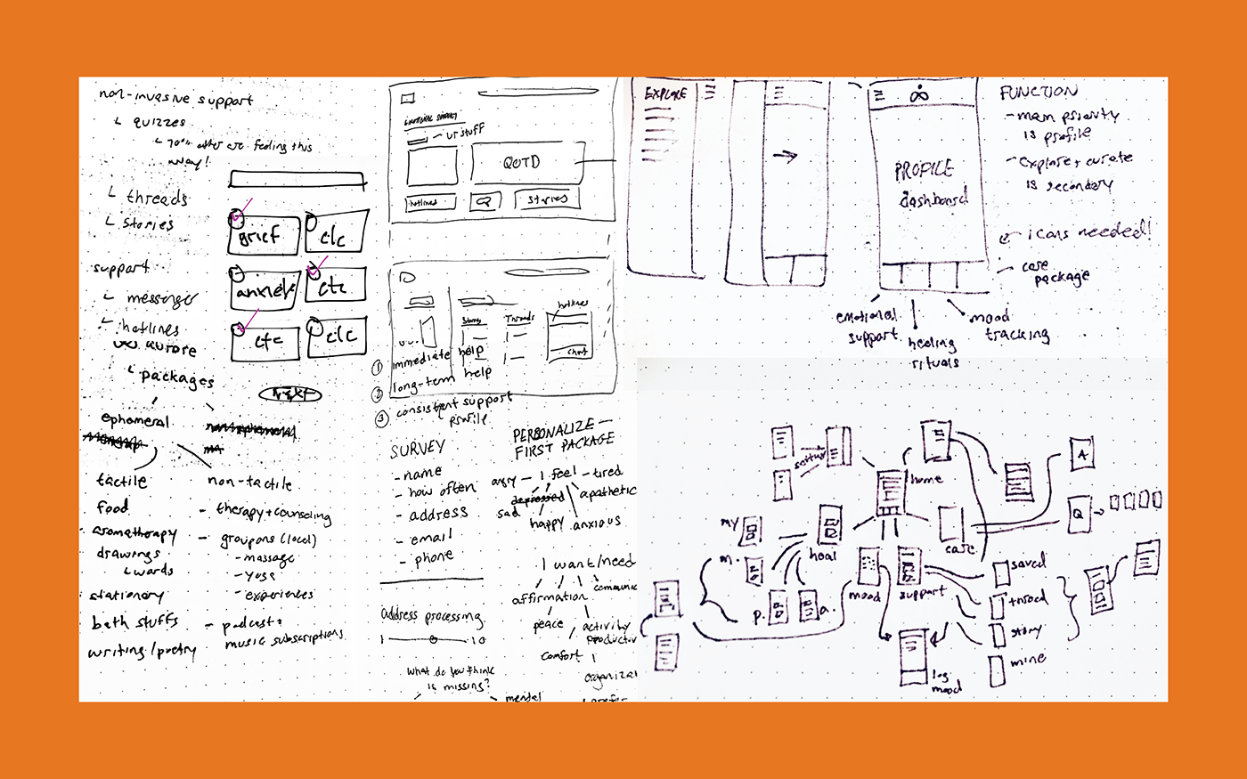
Research of content and potential wireframes
Section 03 User Personas
To better understand the Aurore service and its mobile app, I designed four user personas that are unique in their traumas, goals, and frustrations. These personas will help guide the design of Aurore's key features: mood tracking, emotional support, healing rituals, and care packages.

Section 04 Use Case & Task Flow
After I created my user personas, I then went ahead and identified several use cases based off of one or more persona's goals.
Use Case 01 Input Today's Mood
Lucy is unwinding after a long day and wants to log her mood(s) and important notes. She opens Aurore on her phone and finds "Track Your Mood" on her dashboard's To-Do List. From there she takes the mood survey and inputs the highlights from her day.
Use Case 02 Curate Stories and Threads
Lily needs to relate to others in order to cope with her trauma. She opens the Aurore app and selects the emotional support icon then browses through the stories and threads. After skimming an article, she decided to save it to her "saved content" which could be found on her dashboard and emotional support home page.
Use Case 03 Create Content
Benjamin wants to write about a trauma-related issue to better understand it. He opens the Aurore app and selects the add icon in the top right corner of the screen. He selects "Create Story" and is guided to and empty template where he can input his content.
Use Case 04 Practice Healing Ritual
Richard is having a trauma-related anxiety attack and needs to cope immediately to calm down. He reaches for his phone and on his dashboard is "My Rituals". He picks his go-to ritual and follows the guided content to calm down.
Use Case 05 Order Care Package
Natalie likes the idea of receiving a monthly care package to support her during this difficult time. She opens the Aurore app and sets up a subscription through the care package page. Once she fills in a payment plan, purchases points, and inputs her shipping info, she is ready to take her first survey, which will dictate what goodies will be provided in her first package. Once she's done with the survey, she can track the package.
Section 05 Wireframe Flow
Before imposing any brand colors or content on the Aurore app, I focused on low fidelity wireframes to better understand how users will navigate the platform's content and its four key features, which have their own navigation section on the bottom of the screen. From here, I can test users and understand where improvements are needed.

Section 06 Visual Design & Prototyping
It was intuitive to keep the interface clean and light without any additional overwhelming colors. With only pops of the brand color appearing throughout the application, from the navigation to selected items, the content is black and white. The images within the ritual decks and emotional support sections are overlaid with an off-white derived from the brand's orange. Below is a demonstration of the five sections of the application.
Section 07 Website Design
The Aurore website serves two purposes: to market the app and provide an e-commerce platform for the monthly care package feature. The landing page describes the service and gives a brief detail of the service's four features. It then provides a brief introduction of the monthly care package with a promotional video. Lastly, the page features a post from Aurore's social media platforms, encouraging users to follow along daily healing rituals. The demo below guides users through the landing, into the care package section, and lastly the FAQ section. All supplementary pages are not demonstrated here
Section 08 Package Design
The Aurore care package comes in two sizes depending on how many points its user wants to spend for that month. For my thesis, I decided to design the package that would contain small to medium gifts. The mailer box is minimal and economic in design with messaging that welcomes its recipient. The stickers used for sealing contain words of encouragement and the tissue paper is hand-stamped, providing a personal touch.
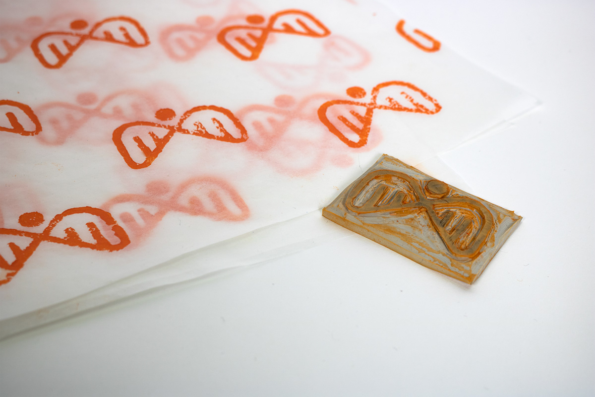

Upon opening the package, recipients will find a paper with their monthly intention. On its back, are the descriptions of the gifts inside the box. Each gift relates to the choices made in the survey when ordering the package. Last but not least, the gifts are delicately wrapped in brand colors to keep the entirety of the package uniform.


Thank you for following me on this great project!


